
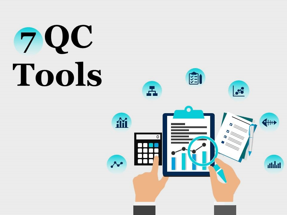
Quality pros have many names for these 7 basic tools of quality, first emphasized by Kaoru Ishikawa, a professor of engineering at Tokyo University and the father of "quality circles." Start your quality journey by mastering these tools, and you'll have a name for them too: indispensable.
1. Stratification
Stratification analysis is a quality assurance tool used to sort data, objects, and people into separate and distinct groups. Separating your data using stratification can help you determine its meaning, revealing patterns that might not otherwise be visible when it’s been lumped together.
Whether you’re looking at equipment, products, shifts, materials, or even days of the week, stratification analysis lets you make sense of your data before, during, and after its collection.
To get the most out of the stratification process, consider which information about your data’s sources may affect the end results of your data analysis. Make sure to set up your data collection so that that information is included.

Quality professionals are often tasked with analyzing and interpreting the behavior of different groups of data in an effort to manage quality. This is where quality control tools like the histogram come into play.
The histogram can help you represent frequency distribution of data clearly and concisely amongst different groups of a sample, allowing you to quickly and easily identify areas of improvement within your processes. With a structure similar to a bar graph, each bar within a histogram represents a group, while the height of the bar represents the frequency of data within that group.
Histograms are particularly helpful when breaking down the frequency of your data into categories such as age, days of the week, physical measurements, or any other category that can be listed in chronological or numerical order.

3. Check sheet (or tally sheet)
Check sheets can be used to collect quantitative or qualitative data. When used to collect quantitative data, they can be called a tally sheet. A check sheet collects data in the form of check or tally marks that indicate how many times a particular value has occurred, allowing you to quickly zero in on defects or errors within your process or product, defect patterns, and even causes of specific defects.
With its simple setup and easy-to-read graphics, check sheets make it easy to record preliminary frequency distribution data when measuring out processes. This particular graphic can be used as a preliminary data collection tool when creating histograms, bar graphs, and other quality tools.

4. Cause-and-effect diagram (also known as a fishbone or Ishikawa diagram)
Introduced by Kaoru Ishikawa, the fishbone diagram helps users identify the various factors (or causes) leading to an effect, usually depicted as a problem to be solved. Named for its resemblance to a fishbone, this quality management tool works by defining a quality-related problem on the right-hand side of the diagram, with individual root causes and sub causes branching off to its left.
A fishbone diagram’s causes and subcauses are usually grouped into six main groups, including measurements, materials, personnel, environment, methods, and machines. These categories can help you identify the probable source of your problem while keeping your diagram structured and orderly.

As a quality control tool, the Pareto chart operates according to the 80-20 rule. This rule assumes that in any process, 80% of a process’s or system’s problems are caused by 20% of major factors, often referred to as the “vital few.” The remaining 20% of problems are caused by 80% of minor factors.
A combination of a bar and line graph, the Pareto chart depicts individual values in descending order using bars, while the cumulative total is represented by the line.
The goal of the Pareto chart is to highlight the relative importance of a variety of parameters, allowing you to identify and focus your efforts on the factors with the biggest impact on a specific part of a process or system.

Out of the seven quality tools, the scatter diagram is most useful in depicting the relationship between two variables, which is ideal for quality assurance professionals trying to identify cause and effect relationships.
With dependent values on the diagram’s Y-axis and independent values on the X-axis, each dot represents a common intersection point. When joined, these dots can highlight the relationship between the two variables. The stronger the correlation in your diagram, the stronger the relationship between variables.
Scatter diagrams can prove useful as a quality control tool when used to define relationships between quality defects and possible causes such as environment, activity, personnel, and other variables. Once the relationship between a particular defect and its cause has been established, you can implement focused solutions with (hopefully) better outcomes.

7. Control chart (also called a Shewhart chart)
Named after Walter A. Shewhart, this quality improvement tool can help quality assurance professionals determine whether or not a process is stable and predictable, making it easy for you to identify factors that might lead to variations or defects.
Control charts use a central line to depict an average or mean, as well as an upper and lower line to depict upper and lower control limits based on historical data. By comparing historical data to data collected from your current process, you can determine whether your current process is controlled or affected by specific variations.
Using a control chart can save your organization time and money by predicting process performance, particularly in terms of what your customer or organization expects in your final product.

But VQMS Pvt.Ltd . has made it all easy for the curious beginners to master this skill . We provide you the best platform , rigorous training ,daily assignments that will make you the master of this trade . Do not let this pandemic hold you back . Be optimistic , grab this opportunity and alchemize the inner you ! You just need a little encouragement and motivation and VQMS is there to help you !
Visit our website https://vqms.co.in/ to know more about ISO Certification and training!
Do visit VQMS Catalog to identify services needed for ISO and for free Webinars and Work shop.
About VQMS - VQMS (Vigorous Quality Management System), is a management consulting company towards Quality and Management.
VQMS is towards TRAINING -CONSULTING - AUDITS - ACCREDITATION - CERTIFICATIONS
VQMS is a team of highly experienced and acknowledged experts in the field of the Training, Consultation and Outsourcing services for national and international boundaries in Lean Six Sigma, Quality & Processes Management and other Corporate boundaries (Corporate Governance Management).
VQMS Pvt Ltd :- Govt. Reg. no - 229559
ISO 9001 Certified
MSME Regd
International Accreditation , USA
Comments
Post a Comment